
Because the wrong shade of beige can ruin your vibe—and your resale value.
Ever chosen a paint color that looked amazing in the store—but completely wrong on your walls? You’re not alone. One of the biggest design regrets homeowners face is picking the wrong paint color. Why? Because color isn’t just color—it’s light, mood, texture, psychology, and resale wrapped in a few coats of pigment.
Let’s expose the top 5 paint color mistakes people make so you don’t have to repaint your living room twice (or hate your bathroom forever). And yes, we’ll sprinkle in the science, psychology, and pro tips that interior designers and real estate agents swear by.
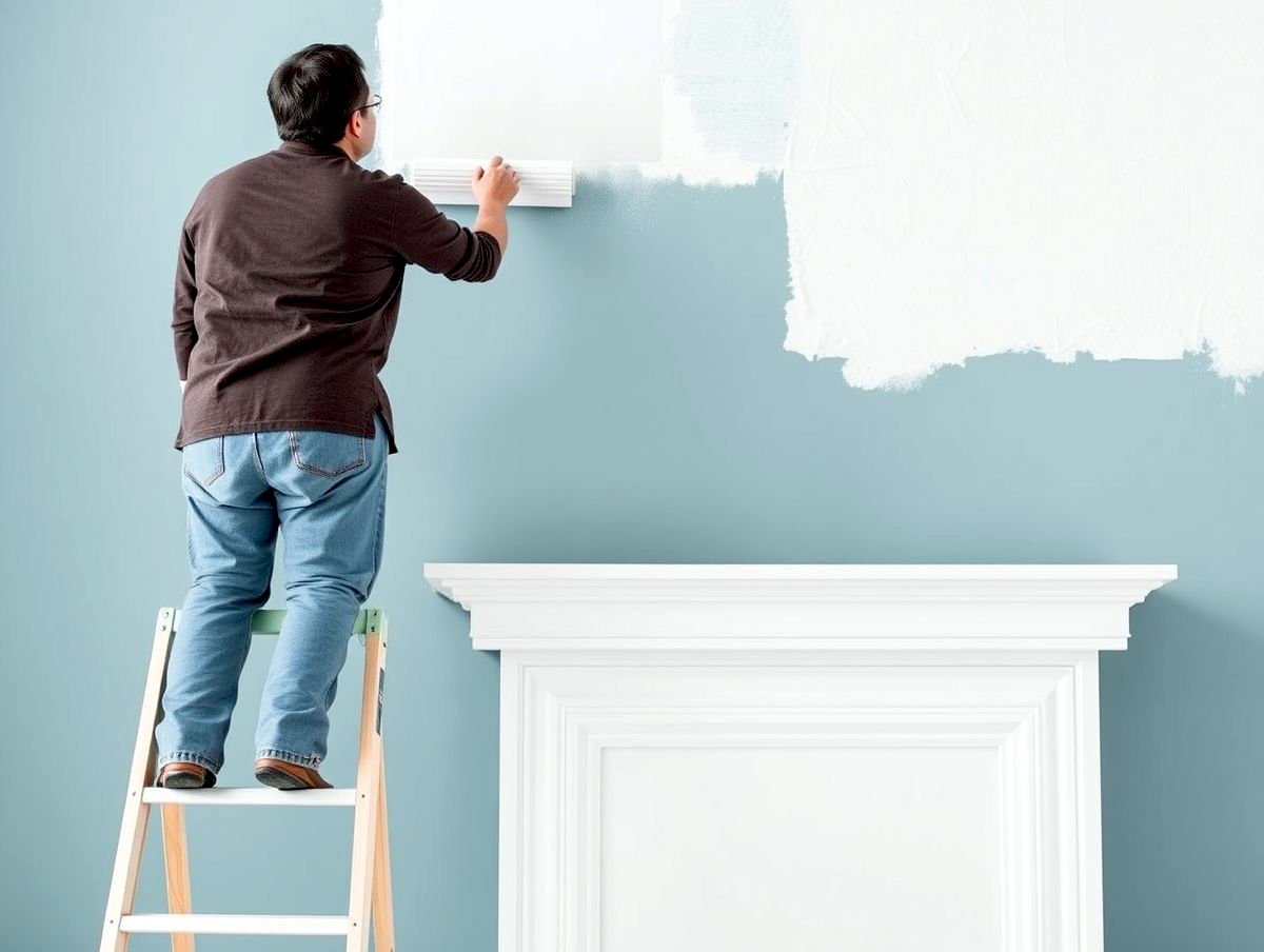
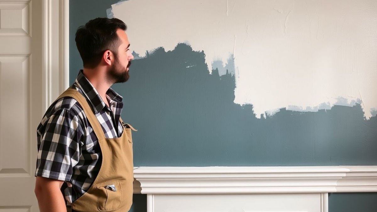
🎨 1. Choosing Paint at the Store Without Testing at Home
Biggest mistake? Believing that paint chips under fluorescent lighting are your best guide.
Paint colors look dramatically different under:
- Natural sunlight vs. artificial lighting
- Warm LED vs. cool white bulbs
- Morning vs. evening light
Pro tip:
→ Always buy a sample size and test it on multiple walls at different times of the day. Live with it for 48 hours.
🧠 2. Ignoring Undertones (and Clashing with Furniture)
A wall can look “gray”… until you realize it has purple, green, or blue undertones that don’t match your floors or couch.
Common paint color families and their sneaky undertones:
| Color Family | Possible Undertones |
|---|---|
| Gray | Blue, Green, Purple |
| Beige | Pink, Yellow, Orange |
| White | Blue, Yellow, Green |
| Greige | Brown, Green, Violet |
Pro tip: Compare your chosen paint to a pure white sheet of paper to spot undertones.
Mistake homeowners make: Painting the whole house in a trendy color without considering existing flooring, furniture, cabinets, or countertops.
🖼️ 3. Following Trends Blindly
Yes, greige was the queen of 2020. But what works in a California condo might fall flat in your rustic Texas ranch.
Trendy ≠ Timeless.
Homeowners often fall in love with online inspiration (thanks, Pinterest), but forget to ask:
- Will this color age well?
- Does it match my regional style?
- Will it make my home harder to sell?
Pro tip:
Use trendy colors as accents, not the entire palette. Paint a feature wall, cabinet, or door—but keep base walls classic if resale is a concern.
Search intent rising: “2025 timeless paint colors”, “is navy blue paint outdated?”
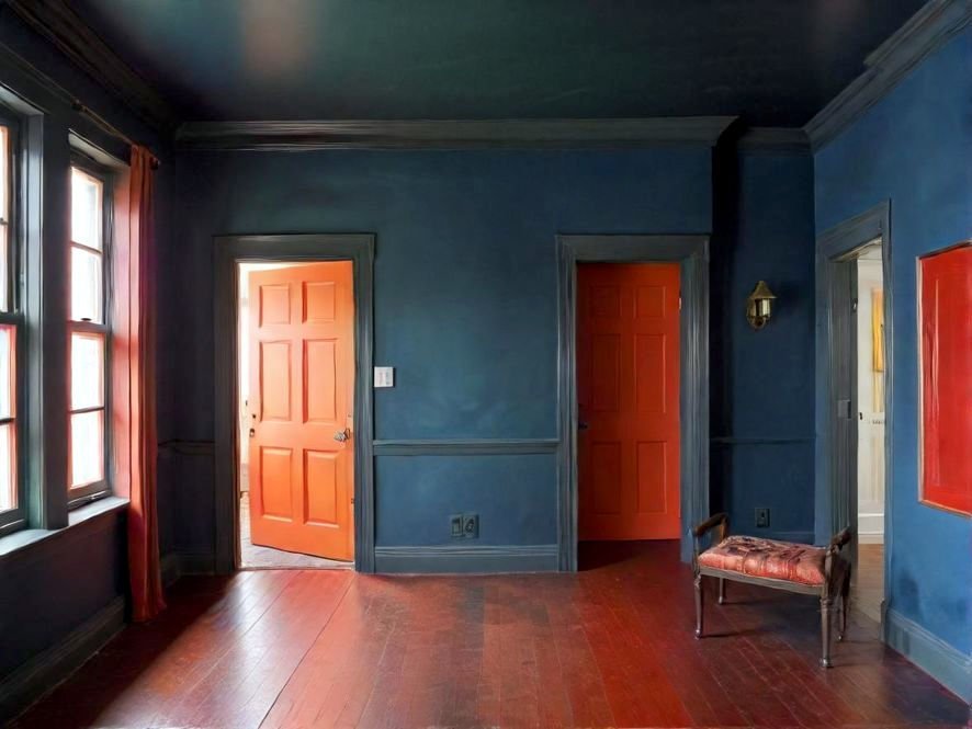
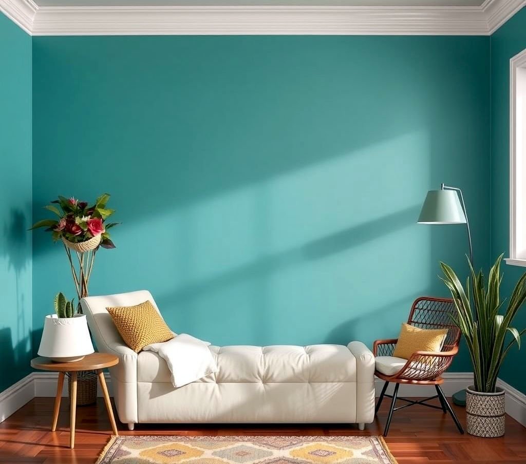
🚫 4. Choosing Colors That Are Too Bold or Too Dull
Yes, color has emotion. And the wrong color in the wrong room can subconsciously drain or overstimulate.
Bold colors that can overwhelm:
- 🔴 Bright reds (appetite stimulator, but stressful in bedrooms)
- 🔵 Electric blues (great in playrooms, too much in small bathrooms)
- 🟣 Deep purples (elegant or oppressive—no in-between)
Dull colors that feel lifeless:
- Too much beige or off-white in low-light rooms = flat & gloomy
Pro tip:
Go bold in:
- Accent walls
- Dining rooms
- Powder rooms
Use calming tones in:
- Bedrooms
- Offices
- Living rooms
Psychology-backed: Warm neutrals encourage calm. Blues aid focus. Greens promote balance.
🪞 5. Forgetting About Room Size, Light, and Finish
Room Size
Dark colors make a room feel smaller. Light colors open up the space. Obvious? Maybe. Overlooked? Constantly.
Light
North-facing rooms get cool light—warm colors help balance. South-facing rooms are naturally warmer—cool colors calm them down.
Paint Finish
Homeowners often ignore how sheen affects perception:
- Matte/Flat = hides flaws, ideal for ceilings and bedrooms
- Eggshell/Satin = soft glow, perfect for living rooms and hallways
- Semi-gloss = durable, best for kitchens and bathrooms
- Glossy = dramatic but shows every imperfection
Mistake: Using high-gloss on uneven walls = hello, visual noise.
✅ Final Checklist: How to Choose Paint Colors Like a Pro
- 🔲 Sample at home, on every wall
- 🔲 Evaluate under different lighting conditions
- 🔲 Cross-check undertones with your furniture and flooring
- 🔲 Use bold colors sparingly
- 🔲 Consider sheen, light direction, and room purpose
- 🔲 Ask yourself: Will I love this in 5 years?
🧠 Conclusion: Color Is a Tool—Not Just a Trend
Choosing the right paint color can enhance your mood, your style, and your home’s value. The wrong color? It can tank your vibe—and your ROI.
Avoid these five common mistakes, and your home will not only look great—it will feel like you.
📚 Coming Soon: Related Articles You Shouldn’t Miss
- “The Psychology of Color in Home Design”
How your paint choices impact mood, focus, and relaxation. - “How to Choose the Perfect White Paint”
Not all whites are created equal. Learn the warm, cool, and neutral white codes. - “Accent Wall Ideas That Actually Work (2025 Edition)”
Trendy, bold, and balanced—paint techniques that pop. - “The Ultimate Guide to Paint Finishes: When to Use Matte, Satin, or Gloss”
One mistake here, and you’ll be repainting next year. - “Top 10 Timeless Paint Colors Designers Use Again and Again”
Colors that won’t make you cringe in photos five years from now.


Pingback: Choosing the Perfect Paint Colors
Pingback: DIY vs. Professional Painting